


Understanding Color Theory in Contemporary Fine Art: Mechanics, Emotion, Depth, and Light

Colour is one of the first things a viewer notices and one of the last things they fully understand. In contemporary fine art, it is never only decoration. It structures attention, sets emotional pressure, builds space, and changes how an image is perceived over time.
A red field can feel near or forceful. A pale blue can seem distant, quiet, or unstable. A green next to violet can create tension that feels almost physical. These effects are not accidents. They arise from a mix of science, perception, material behaviour, and cultural memory.
That is why understanding color theory matters. It gives artists a practical framework for arranging hue, value, and intensity. It also gives collectors, curators, and cultural readers a more exact language for looking at painting, installation, print, and digital image-making.
Colour theory operates in two ways at once. It is a system of relationships, grounded in the behaviour of light and the eye. It is also an emotional language, shaped by history, material, context, and personal response. Contemporary artists move between these two registers with great care.
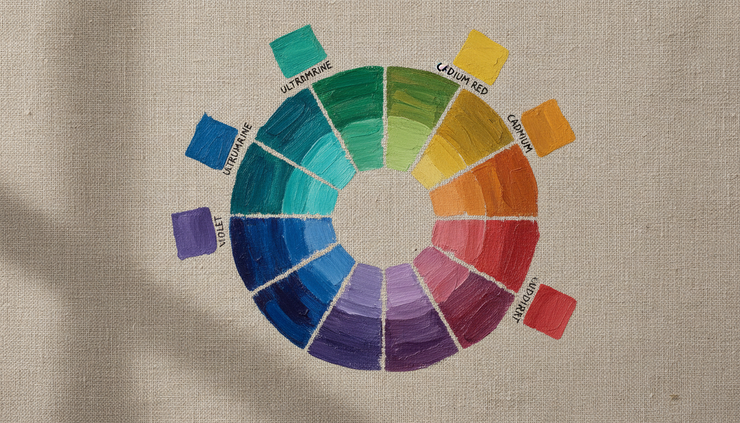
1. The colour wheel gives artists a working map of visual relationships
The colour wheel is often introduced as a simple teaching tool, yet its value runs far beyond the classroom. It is a compact model of how hues relate, oppose, and modify one another. For painters, it offers a way to predict visual behaviour before colour reaches the canvas. For viewers, it explains why some works feel calm, tense, radiant, or deliberately unresolved.
At its core, the wheel arranges hues in a circle so that their relationships become visible. The most familiar version places red, yellow, and blue as primary colours in traditional painting. These are called primary because, in this model, they cannot be mixed from other pigments and can generate many other hues.
From these come the secondary colours:
Orange, made from red and yellow
Green, made from yellow and blue
Violet, made from blue and red
Between primary and secondary colours sit tertiary colours, such as red-orange, yellow-green, and blue-violet. These intermediate hues matter greatly in fine art because few serious paintings rely on pure primary or secondary colour alone. Much of a painting’s character comes from the in-between zones, where colour becomes specific, subtle, and materially distinct.
The phrase color wheel mechanics often sounds technical, but the principle is clear. A colour changes meaning according to what surrounds it. A yellow placed beside white may feel warm and delicate. The same yellow beside deep violet may seem sharper and more luminous. A blue-grey can appear cool beside ochre and almost warm beside black.
The wheel helps explain several key relationships.
Complementary colours create tension and clarity
Complementary colours sit opposite each other on the wheel. Red and green, blue and orange, yellow and violet are standard examples. When placed side by side, complements intensify each other. This can create visual energy, edge definition, and a sense of vibration.
When mixed as pigments, complements often neutralise each other. A red mixed with green may produce brown, grey, or a muted earth tone, depending on the pigments used. This dual behaviour matters. Complements can make a surface feel more alive when separated, or more restrained when blended.
Many contemporary painters use this effect with precision. A field of muted green may hold a small red mark that appears far stronger than its size suggests. A blue-black ground may make an orange line feel almost lit from within. The eye responds to the opposition before the mind identifies it.
Analogous colours create continuity
Analogous colours sit next to one another on the wheel. Blue, blue-green, and green form one family. Red, red-orange, and orange form another. These relationships tend to feel more continuous because the colours share visual qualities.
Artists use analogous palettes to build atmosphere. A work based on green, blue-green, and blue may feel aqueous, distant, or reflective. A painting built from orange, red-orange, and red may feel dense, warm, or bodily. The result depends on value, surface, scale, and context, but the relationship itself usually supports visual cohesion.
Temperature shapes the viewer’s sense of movement
Colour temperature is another central idea. Reds, oranges, and yellows are often described as warm. Blues and some greens are described as cool. This language is not absolute, since a blue can be warm compared with another blue, and a red can be cool compared with orange. Temperature is relational.
Warm colours often appear to advance. Cool colours often appear to recede. Artists use this tendency to build spatial movement without relying on linear perspective. A small warm passage can pull forward from a cool ground. A cool shadow can make a warm form seem closer and more solid.
Value and intensity matter as much as hue
Hue names the colour family, such as red or blue. Value describes lightness or darkness. Intensity, sometimes called saturation, describes purity or strength. A pale pink and a deep crimson may share a red base, but they behave very differently. A high-intensity ultramarine has another effect from a muted blue-grey.
This is where colour theory becomes more than a wheel. A painting succeeds through the control of contrast, rhythm, proportion, and material surface. The wheel offers orientation. The canvas tests the decision.
2. Colour palettes carry psychological and emotional force
Colour has emotional force because perception is never neutral. The eye receives light, but the mind interprets experience. A palette can feel solemn, tender, severe, unstable, ceremonial, synthetic, or intimate. These responses arise from bodily sensation, memory, cultural association, and the internal structure of the work.
The study of color psychology in painting should be handled with care. Red does not always mean anger or passion. Blue does not always mean calm. White does not always mean purity. Meanings shift across cultures, histories, materials, and artistic intentions. Still, recurring tendencies give artists a useful language.
A dark, low-contrast palette can slow the act of looking. It may suggest gravity, privacy, or mourning. A high-key palette with pale yellows, pinks, and blues can create openness, fragility, or artificial sweetness. Acid greens and synthetic violets may suggest unease, digital light, or altered nature. Earth colours can refer to body, soil, age, labour, or restraint.
The emotional power of colour rarely comes from a single hue. It comes from relationships within a palette.

A palette creates mood through proportion
A painting that contains red is not necessarily a red painting. Proportion changes everything. A large quiet field with a thin red line may feel tense, precise, or wounded. A canvas filled with red may feel immersive, oppressive, ecstatic, or theatrical, depending on its surface and context.
Artists often control emotional tone by deciding which colours dominate and which appear as accents. A restrained painting may use one intense colour sparingly. A more forceful work may place saturated colours across a large area, giving the viewer little visual rest.
Proportion also affects rhythm. Repeated colour notes can guide the eye across a canvas. A blue mark in one corner may answer another blue passage elsewhere. These echoes create structure as much as mood.
Cultural associations deepen the image
Colour is tied to ritual, politics, religion, fashion, architecture, and design history. Gold may suggest sacred space, wealth, light, decay, or surface illusion. Black may suggest mourning, elegance, authority, refusal, or emptiness. Green may carry associations with land, ecology, growth, poison, or digital chroma.
Contemporary fine art often works with these associations knowingly. An artist may use a colour because it carries historical weight, then place it in a context that unsettles that history. A soft pastel palette may be used to address difficult subject matter. A severe monochrome may contain subtle warmth that only appears through prolonged looking.
This is one reason colour resists fixed translation. It can state and question at the same time.
Emotional resonance depends on material
The same hue changes character across oil paint, acrylic, watercolour, pastel, print, textile, glass, projection, and screen. Oil paint can hold depth through glaze and body. Acrylic can produce flat, sharp, or plastic effects. Watercolour relies on transparency and paper light. Pigment on raw canvas behaves differently from pigment sealed under varnish.
Material affects emotional reading. A red stain soaked into fabric feels different from a red enamel surface. A chalky blue absorbs light differently from a glossy blue. A digitally rendered green has a different presence from a mineral pigment suspended in oil.
This material dimension matters for collectors and curators because colour is not only optical. It is physical. The surface carries evidence of pressure, dilution, layering, correction, and time.
Monochrome does not mean simple
A single-colour work may appear minimal at first, but monochrome painting often heightens subtle differences. When hue is restricted, the viewer becomes more aware of value, texture, edge, and light. A black painting may contain blue-black, brown-black, and reflective black. A white painting may shift with every change in illumination.
Monochrome work shows that colour is never isolated from surface. The apparent restraint can produce intense attention. The viewer begins to see not one colour, but a field of minute changes.
3. Colour builds space, contrast, and visual balance on the canvas
Colour does not simply cover form. It can create form. It can make space feel shallow, deep, compressed, open, stable, or fractured. In this sense, colour is a structural tool. It shapes how a viewer’s eye moves and how the body senses distance from the work.
This is central to visual harmony in fine art. Harmony does not mean prettiness or ease. It means that the relationships within a work feel purposeful. A visually harmonious painting may be calm, but it may also be tense. What matters is that colour, scale, contrast, and placement hold together.
Spatial depth can emerge without traditional perspective
Western perspective often uses lines that converge towards a vanishing point. Colour can build space by another route. Warm and saturated colours tend to come forward. Cool, muted, and lighter colours may appear to recede. Strong value contrast can bring a shape forward, while low contrast can push it back.
Atmospheric perspective uses related effects. In observed landscapes, distant forms often appear cooler, paler, and less distinct because of light scattering through air. Painters can apply this principle literally or abstractly. A contemporary canvas may use bands of colour rather than recognisable landscape forms, yet still evoke distance through shifts in value and temperature.
Layering also creates depth. A transparent glaze over a dry underpainting can make colour appear suspended within the surface. A scumbled pale layer over dark paint can suggest air, dust, or passing light. A hard-edged flat shape can interrupt this depth and return the viewer to the physical canvas.
Contrast gives the eye a path
The eye seeks difference. It notices where light meets dark, where saturated colour meets grey, where warm meets cool, and where one texture interrupts another. Artists use contrast to direct attention.
There are several forms of contrast:
Hue contrast
One colour family meets another, such as blue against orange.
Value contrast
Light meets dark, often producing the clearest structure in a work.
Saturation contrast
Intense colour meets muted colour, creating a hierarchy of emphasis.
Temperature contrast
Warm colours press against cool colours, generating movement.
Edge contrast
Sharp transitions meet soft transitions, changing speed and focus.
A painting with no contrast may feel still, hazy, or unresolved. A painting with too much equal contrast can feel restless. Skilled artists vary contrast so that the eye has both activity and rest.
Balance comes from distribution rather than symmetry
Visual equilibrium does not require equal halves. A small area of intense colour can balance a large area of muted colour. A dark passage near the edge of a canvas can stabilise a field of pale colour. A single warm shape can counter a broad cool ground.
This balance is closer to weight than measurement. Colours have visual weight according to darkness, intensity, size, placement, and edge. A small black square can feel heavier than a large pale yellow wash. A red dot near the edge may pull harder than a central grey form.
Contemporary painting often explores this tension. A work may seem spare, yet hold together through exact colour placement. Another may appear dense, yet remain balanced because value and hue are carefully distributed.

The edge is where colour becomes active
Edges deserve close attention. Where one colour meets another, optical energy increases. A hard edge can make colour feel graphic and immediate. A soft edge can create atmosphere, transition, or uncertainty. A broken edge can let colours breathe into one another.
The boundary between two colours may change both. A grey beside orange can take on a blue cast. A violet beside yellow can appear sharper than it would alone. This effect, known through studies of simultaneous contrast, shows that perception is comparative. The eye does not read colour in isolation.
Artists such as Josef Albers made this principle central to modern colour study. His work demonstrated that the same colour can appear different depending on its neighbours. This remains vital for contemporary practice. A curator assessing a painting under changing light, or placing works near one another, sees this effect in real time.
4. Light, perception, and colour now connect digital and traditional practice
Colour theory began with observation of light, pigment, and the eye. Contemporary practice expands that field. Artists now work across canvas, print, projection, screen, installation, and mixed media. The same colour may exist as mineral pigment, reflected gallery light, emitted screen light, or projected illumination. Each mode behaves differently.
This is where color theory in art meets technology without losing its material roots. A painter still considers pigment, ground, transparency, and drying behaviour. A digital artist considers pixel colour, screen calibration, brightness, and colour space. A curator considers room light, wall colour, sightlines, and conservation needs. These concerns are linked by perception.
Pigment and light follow different systems
Traditional painting works mainly with subtractive colour. Pigments absorb some wavelengths of light and reflect others. A red pigment appears red because it reflects red wavelengths and absorbs much of the rest. When pigments mix, they often become darker or duller because more light is absorbed.
Digital screens work with additive colour. They emit light through red, green, and blue channels. When these channels combine at full strength, they produce white light. Mixing light is not the same as mixing paint. This explains why a colour that glows on a screen may be difficult to reproduce in pigment or print.
This difference matters in contemporary painting techniques that begin digitally and move into physical form. An artist may sketch a composition on a tablet, then translate it into oil, acrylic, or print. During that translation, colour changes. The glow of the screen becomes surface reflection. Pure digital brightness becomes material limitation. The artist must decide whether to preserve the digital sensation, adapt it, or let the change become part of the work.
Perception changes with lighting conditions
A painting is not fixed in the way it appears. Its colour changes under daylight, warm artificial light, cool artificial light, and mixed light. A work seen in a studio may shift when installed in a gallery. A glossy surface may reflect its surroundings. A matte surface may absorb light and appear more stable.
This has practical and philosophical implications. Colour exists in relation to conditions. The pigment is physical, but the experience of colour arises in a meeting between object, light, eye, and mind.
This is especially clear in works with metallic, fluorescent, translucent, or interference pigments. Some surfaces change as the viewer moves. Others respond strongly to the angle or colour temperature of illumination. The artwork becomes temporal. It unfolds through movement and duration.
The eye completes the work
Human colour perception is active. The retina contains cone cells that respond broadly to different ranges of light. The brain compares signals and creates the experience of colour. This process is adaptive, not mechanical.
Colour constancy shows this clearly. A white sheet of paper can still appear white under warm evening light, even though the wavelengths reaching the eye have changed. The brain adjusts. Artists can use this tendency, playing with expectation and correction.
Afterimages offer another example. Staring at a strong colour can produce a ghostly impression of its complement when the eye shifts away. Op artists and many abstract painters have used such effects to make colour feel unstable, mobile, or alive.
These perceptual facts connect colour theory to wider questions of time and space. A painting is not only an image located on a wall. It is an event that happens through looking. The viewer’s movement, attention, and memory shape the experience.

Colour theory gives language to both structure and feeling
Colour theory is often reduced to rules, but fine art rarely uses it that way. A rule can help an artist begin. It cannot determine the final meaning of a work. The most compelling colour decisions often come from testing, revision, and looking slowly.
A complementary pairing may create force, but force can be used for beauty, unease, irony, devotion, or critique. A muted palette may create quiet, but quiet can suggest intimacy, grief, distance, or concentration. A digital glow may feel artificial in one work and sacred in another. Context changes the reading.
For this reason, colour theory is best understood as a discipline of relationships. It studies how colours behave with one another, how materials alter them, how light activates them, and how perception completes them.
For collectors and curators, this offers a more precise way to look. Instead of asking only whether a palette is appealing, one can ask:
How does the colour structure the space of the work?
Which hues carry the greatest visual weight?
Does the palette invite calm looking or create pressure?
How do surface, light, and scale change the colour experience?
Does the work rely on harmony, rupture, restraint, or optical tension?
These questions open the work without reducing it to explanation.
A refined way to look at colour
Contemporary fine art treats colour as knowledge and sensation at once. The colour wheel explains relation. Palette explains mood. Contrast explains attention. Light explains change. Perception explains why no colour is ever entirely stable.
The value of colour theory lies in this double nature. It gives structure to visual decisions and depth to emotional response. It helps explain why a painting can feel balanced without symmetry, spatial without perspective, and luminous without literal light.
To look closely at colour is to see a work think. Every hue, interval, edge, and shift of value carries a decision. Some decisions announce themselves at once. Others appear only after time. That slow recognition is one of the great pleasures of contemporary art.


Comments